MSExcel - Charts
One of the great things about spread sheets is just how easy it is to convert data in a table into a nice looking chart.
A chart is a graphical way of presenting data.
Charts are used to represent all types of information and there are a wide variety of different kinds. The most popular are bar charts and pie charts, like the ones below.
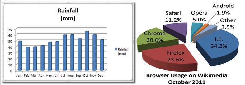
Can you guess which is a bar chart and which is a pie chart?
I hope so.
The steps to creating a chart in MSExcel are....
- Type in all of your data and format it nicely with table headings, colours, etc.
- Highlight the data that you want to chart and select Insert... Chart...
- Select your chart type and then move the chart to its own sheet
- Make alterations to your chart (labels, fonts, colours, etc) until you get it just right.