|
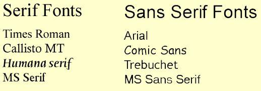
Font Selection When Designing Web Pages There are two basic kinds of fonts - serif and sans serif Serif fonts have small lines on the end of characters. Sans serif fonts have no lines. Below are examples of serif and non serif fonts.
What kind of font type should be used on a web page? Go to the web sites of the following large companies and check out the font that font did the web site developers choose - Serif or Sans Serif? Canadian Broadcasting Corporation (CBC) It should be Arial, a Sans Serif font. Try other web sites of large corporations. You should find these also use a sans serif font.
Print (Paper) Medium What is the prevalent font type - serif or sans serif? You should find it is a serif font, probably Times Roman.
What the "Experts" say. Sans Serifs fonts are easier to read on a computer screen, so web pages should be written using a sans serif font. Arial is the preferred font. Serif fonts are easier to read in printed materials such as books, magazines, etc.
Suggested Fonts I recommend the Arial font for your web page. A primary grade level web page can look good in Comic Sans. Do not choose a variety of fonts for your web page or web site - you may find that users do not have your chosen fonts on their system and what you feel is an wonderful font, may be indecipherable on another computer. Most users have Arial font installed so if you use this one, then you are almost certain they will view your page as you designed it.
|